
Unboxing Sun Valley: 2025 Packaging Design Trends That Work for Real Idaho Businesses
Look, you’re up before the sun in Hailey, boxing honey jars while the kettle boils. You’re at the Bellevue stand by eight, praying the wind doesn’t scatter your labels. You’re in Ketchum at closing time, sliding six-packs across the counter and hoping the guy in the Patagonia vest remembers you next week. That’s the gig. At hoist studio we live it too. We’re not here to sell you a dream. We’re here to sell more of whatever you’re already making.
2025 packaging design in Sun Valley isn’t about neon or holograms. It’s about three things that actually matter: it has to look like it belongs here, feel good in a customer’s hand, and cost less than the profit it brings in. Below is what’s working right now, plain and simple, with examples from shops and stands you probably know.
Start with color pulled straight from the hills—sage, clay, river-rock gray. Layer two or three flat blocks on kraft or recycled white. Add a light texture that reads like wind over dry grass. A Hailey distiller did this on their gin bottles last spring. Same printer, same stock, 18 % more bottles walked out the door. Customers said the label “felt like the mountains.” You can do the same with two photos from your phone and a $200 digital print run.
Next, lean into the old trail-map look—hand-drawn contour lines, retro type, one hit of orange or teal. Clean it up so it still scans on a cracked iPhone screen. A Ketchum coffee roaster put a stylized Baldy ridge on their bags. Skiers started using the empty bags as stuff sacks on hut trips. Every summit selfie became free advertising. Got an old map in the glovebox? Scan it. We’ll trace the lines and hand you a print-ready file for the cost of a growler fill.
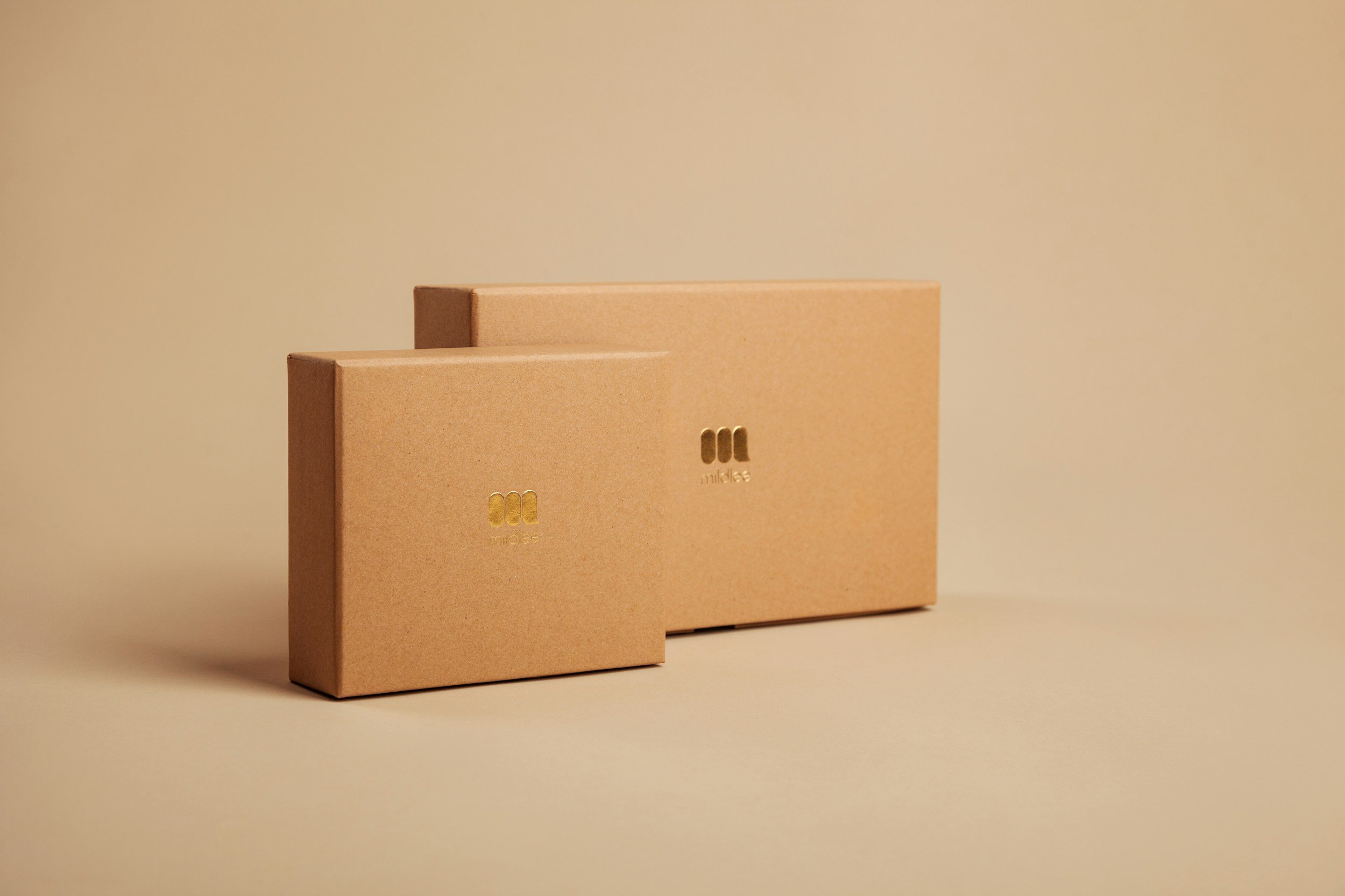
Now make it something people want to touch. Raised ink on your logo. A debossed ridge you can feel with your eyes closed. A matte sleeve that crinkles like a topo. A Bellevue jam maker added a raised wheat stalk to their lids. Kids at the market traced it with sticky fingers. Parents bought two jars instead of one. Pick one tactile trick—emboss your name or a simple pine—and run it on the same press as your labels. Pennies per unit, not dollars.
Add one extra second of attention. A peel-back sticker that says “Thanks from Trail Creek” in your own handwriting. A QR square that plays a ten-second clip of you pouring the first pint. A Sun Valley gear shop printed QR codes on hangtags. Scanners got a discount and a photo of the exact trail where the fabric was tested. Thirty-four percent came back. Record a voice memo on your phone. We’ll turn it into a link and print it on the same sheet as your thank-you card.
Finish with honest eco graphics. No fake leaves. Just a clean lodgepole icon and a line that says “One tree planted per case—GPS plot on Trail Creek.” Pair it with glacier blues fading to white. A local cider maker tied every six-pack to a real sapling. Customers started checking “their” tree on hikes. Sold out three runs early. Partner with the Forest Service or a valley nursery. We’ll design the tag and the tracking page. You plant the trees.
That’s it. No five-part framework, no buzzwords. Just packaging that looks like Sun Valley, feels like money well spent, and keeps customers coming back. Start with one change—new color, one texture, one QR. Test it at the next market. If it moves product, print more.
We’re hoist studio. We’re in the valley. We drink the same coffee, ski the same bowls, and use the same printers you do. Send a photo of your current label and your budget. We’ll send three options that fit—guaranteed.
Let’s make your box the one people keep.